This is a new meme hosted by Sugar & Snark. It came about when Sugar was wondering which cover to use for her #70 Cover of the Week post. She kept on thinking of more than one, and they all seemed to have a theme/characteristic. So she decided to switch things up a bit!
Each week I (along with the S&S ladies) will post a characteristic and choose 5 of my favorite covers with that characteristic. I would love for you to join in and share your 5 favorite covers with the weeks particular characteristic so hop on down to the comments and tell me what you think.
Today’s cover characteristic: Angel Wings
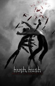
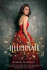
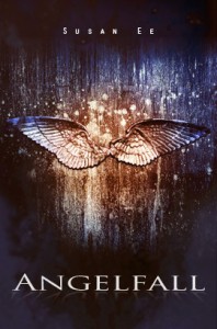
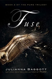
And The Winner…
Branded by Keary Taylor

I’ll be honest…this one was a tough one. I Love the cover the Fuse. There is just something about that exploding golden wings that draws the eye, but when it came down to glass and brass tacks, Branded took the win. Why? Because it’s VERY original. The bottom reflection shows more than the original image which produces a “Huh?” moment, and I love how dark it is. Ominous I guess you could say. Ding. Winner!




Ooooh I forgot about Angelfall! Fuse is my fav I think.
Thanks for joining in last week 🙂
Sugar & Snark