This is a new meme hosted by Sugar & Snark. It came about when Sugar was wondering which cover to use for her #70 Cover of the Week post. She kept on thinking of more than one, and they all seemed to have a theme/characteristic. So she decided to switch things up a bit!
Each week I (along with the S&S ladies) will post a characteristic and choose 5 of my favorite covers with that characteristic. I would love for you to join in and share your 5 favorite covers with the weeks particular characteristic so hop on down to the comments and tell me what you think.
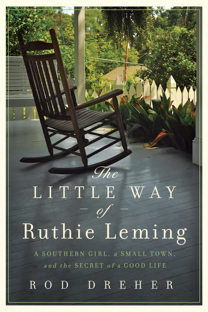
Today’s Cover Characteristic – Chairs
And The Winner Is…
The Little Way of Ruthie Leming
I know what you are thinking. “Man Misty…that’s kind of plain Jane compared to what you normally pick!” And you would be right. But the reason this cover took top prize is FOR it’s “plain-ness.” It’s simple. It’s elegant. It’s….peaceful. This is a common sight in my teeny tiny hometown. The lone rocker. All you need to do is add a glass of ice tea and a good book and what you have here ladies and gents is the perfect day…via cover art. Doesn’t get much better than that.


I didn’t even see the chair on Sarah’s Key cover!
Thanks for joining in last week 🙂
Sugar & Snark
It’s there! 🙂 on the left in the street.