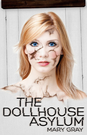
I absolutely love cover art, I could look at it for hours! And since I love it I figured a few of you are likely to love it too. So, I’ve established a weekly (Thursday) post called “Cover Lust” in which I will feature one spectacular cover I consider pretty much perfect. I encourage you to leave your thoughts below (because I’m crazy curious) and if you feel up to it… tell me the title of a book who’s cover YOU lust!
The Dollhouse Asylum by Mary Gray
Ok, so I’m pretty sure that the very first thing YOU noticed about this cover is the cracked girl. Right? Not me. No…I’m not normal like that. For me, the very first thing that caught my attention was the typography. Say WHAT? Yep…I was totally turned on by The Dollhouse Asylum’s mirror split text. You know that incredibly creepy jerky movement technique horror directors love to throw around in their movies to evoke the feeling of total wacked-out-ed-ness? Well…the lettering splits on the cover of this book do the same thing for me. It does have the word Asylum in the title after all…what better way to imply something is horribly awry than to distort something as simple as the title. As for the girl…yeah, I noticed her too. Who wouldn’t? I mean look at her, all beautiful and somber and split to high hell. To be honest…she kind of reminds me of my daughters Barbies after a long day. Which, now that I think about it is not exactly a normal reaction. (Maybe I should look into that.) Anyways…I lust this book cover.
How about YOU?


Hi Misty! I’d love to know what you think of my cover- I created it myself. Check it out if you have a sec:)
http://1geminirising.wix.com/geminirising
Hi Jessica! *waves*
Well, first…I like the faces! They tell a story before you even open the book. Which is a great thing. But, I’m a little confused by what is going on in the middle (between their faces/in front of his) Also..the font to me screams horror, not sci-fi/paranormal, and the fade at the top is a little rough. Maybe you can position the faces closer to the top and move your title to the bottom with the blue wormhole-ish circle behind it. Just a suggestion. Good job though! 🙂